In the heart of modern design, minimalism has become more than a trend—it’s a statement. One of the most powerful expressions of this philosophy is found in simplistic architectural illustration, where form, function, and clarity converge using only the essentials.
What Is Simplistic Architectural Illustration?
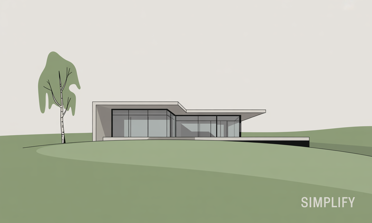
At its core, this style of illustration uses geometric shapes, crisp lines, and a limited color palette—often primary colors—to portray complex structures with elegant restraint. These images often feel bold and clean, yet full of character, despite their minimal details.
Why It Works
-
Clarity in Structure: By removing decorative excess, the foundational forms of buildings stand out. The viewer instantly understands the structure’s function and flow.
-
Focus on Composition: With fewer elements, every line, color, and shape must earn its place. This sharpens the artist’s intent and strengthens the visual impact.
-
Universal Appeal: Minimal, abstract architecture transcends cultural barriers and speaks to a wide audience. It’s understood and appreciated globally.
-
Stylish and Timeless: This approach isn’t just clean—it’s modern, retro, and future-forward all at once. The look easily integrates into branding, wall art, and marketing visuals.
How This Relates to Brand Design
At Stargate Design, we apply the same principles of simplistic illustration to branding and visual identity. Whether we’re designing business forms, promotional materials, or custom product graphics, we always ask: Can this be said with less?
The result? Designs that speak louder—because they say less.
Where You’ve Seen It
You’ve likely encountered this style in:
-
Modern posters or editorial layouts
-
Branding for tech companies or startups
-
Trendy home decor or canvas prints
-
Educational or architectural infographics


