
In a world overflowing with visual noise—ads, social posts, banners, pop-ups, and bold branding—there’s something refreshingly bold about simplicity. While it might seem counterintuitive, the most effective designs often aren’t the ones shouting the loudest… they’re the ones speaking the clearest.
Why Less Is More
Good design isn’t just about what you add—it’s about what you remove. Simplicity strips away the unnecessary to make room for what truly matters: your message. When the visual clutter is gone, your design has space to breathe, and the viewer has space to think.
Clarity Connects
At Stargate Design, we’ve seen firsthand how clean, uncluttered layouts consistently outperform overdesigned pieces. Whether it’s a business card, a brochure, or a promotional mailer, simplicity helps your audience grasp the message at a glance—without confusion or distraction.
Timeless Appeal
Trends come and go, but simplicity is timeless. Think of iconic brands like Apple or Nike. Their visual identity relies on minimal elements—but speaks volumes. Their power comes from consistency, space, and confidence in the message.
How to Simplify Your Designs
-
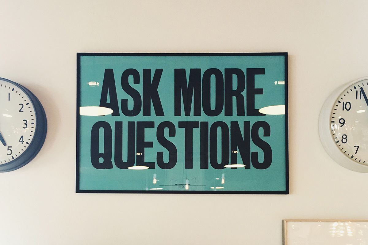
Start with Purpose: Ask, “What’s the one thing I want to communicate?”
-
Limit Fonts and Colors: Stick to a small palette and no more than two font families.
-
Embrace White Space: Let your design breathe. Don’t feel the need to fill every inch.
-
Use Visual Hierarchy: Guide the viewer’s eye to what matters most.
-
Edit Ruthlessly: If it doesn’t serve the message, take it out.
Final Thoughts
Simple doesn’t mean boring—it means intentional. It means your message is so strong, it doesn’t need decoration to be understood. At Stargate Design, we believe in designing with purpose, focus, and clarity. In a noisy world, simplicity stands out.


