
We’ve all had the experience of getting an image just right on the computer, printing it out, and finding out that the printed page didn’t quite reflect what we’d seen. That’s why being careful about your colors is an essential part of print ordering. Here are three tips to ensure that the colors of your print order display perfectly.
1. Get Your Color Profile Right
One of the biggest ways to show your print’s true colors is to get the color profile correct before sending the file to print. Here are the four color profiles you might come across:
Hex: Those of you who have worked in web design are almost certainly familiar with hex colors. A hex triplet is a six-digit, three-byte hexadecimal number like #ff0000 used to represent the color you see on screen—red, in the case of our example number. Hex colors are common in web design, but shouldn’t be used in print.
RGB: RGB is the color system that your computer uses to create color on screen. Because this color system uses light, the colors red, green, and blue are combined to make different colors, with all three being used to create white light.
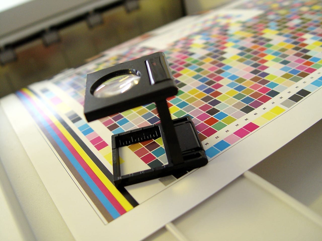
CMYK: CMYK is the color system we use in the print industry. Cyan, magenta, yellow, and black (keytone) inks are used to create color in a wide variety of colors. Dots of each color are put in layers on the paper to create an image. Since there are variations between presses, press operators and other factors, CMYK colors can vary slightly between printings.
PMS: The Pantone Matching System (PMS) colors is a popular spot color system created by Pantone Inc. Because Pantone colors are mixed using precise recipes before they are printed, using PMS color inks is a great way to ensure that you always get just the color you want.
Wondering which color system to use? For most orders, we use PMS colors for spot color and CMYK for full color print. The exception to this is sublimation—this process uses RGB colors to create vibrant print on a variety of specialty products, badges, and more. If you’re not sure how to format your files, be sure to double-check the file requirements before ordering.
2. Choose Your Stocks Carefully
The stock you choose is an absolutely essential element of how the final printed design looks. A full color design will look more vibrant on a bright white stock, for example, than it will on an ecru stock. Because the ink isn’t fully opaque, the color of the stock will show through, and this makes stock choice very important when creating print.
Ever wonder why we don’t recommend printing blue on a yellow stock? This is why—the print will end up looking green.
3. Don’t Forget Printing Black in Full Color Print
We’ve talked about printing black before, and it’s still an important part of ensuring your colors look right. After all, colors will pop more against a rich black than they will against gray. When you order full color print, we recommend using 80% cyan, 80% magenta, 80% yellow, and 95% black to ensure that your black appears as dark and rich as possible.